

Overview
My Role: UX Designer Date: Fall 2020
Project Team: Ines Acosta, Sean Perryman, Ting Yu, Brandon Kim
SafeEats is an app designed to help find and track food intoleraces. Users can use it to determine their food intolerance(s), track their daily intake and symptoms, and identify adverse ingredients in their food.
Problem
We discovered that people with food intolerances lack a reliable system to help determine the safety of the food they’re consuming and which ingredients are causing adverse reactions.
Solution
Our system helps users find and track their meals as well as how they made them feel. The Elimination Diet section guides them through determining what the user might be allergic to.
“I tested several systems and apps, but none of them helped me track how food made me feel" - SafeEats user
Discovery.

User Interviews
To learn about how food intolerances affect our users’ lives, we conducted 8 virtual interviews focused on our users’ pain points. The image at the top is a semi-structured interview I conducted with a user.

Survey
Our survey ran parallel to our interview process and served as a method to augment the data acquired in the interviews. It helped us gather data on the edge cases we wouldn’t have found through individual interviews.

Qualitative Inquiry + Analysis
Our users depended heavily on food labels to learn about the product they’re consuming. Because of this, we performed a qualitative inquiry and an analysis on the task of finding pasta sauce that met the participant’s needs.

Findings + Analysis
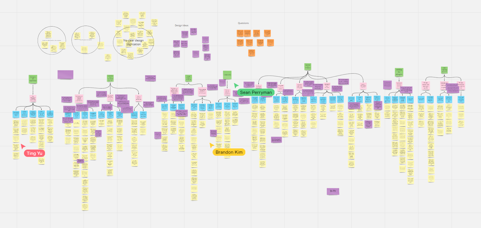
After completing the research methods, we interpreted our notes and organized them through an affinity map. In the end, we determined the following findings:
Food packaging labels can be confusing and lack clear information on allergens
People use multiple sources when finding allergen or other food risk information online
Users have to test their body for adverse reaction, and they often use a complex system dubbed the Elimination Diet
Design.
Ideation
After organizing our data into the affinity map, we split up and reviewed the data on our own. During this time, we also added our own ideas to the board.
Each of these ideas was discussed and consolidated into our system’s idea.
The Concept
SafeEats has several moving pieces, and each communicates with another:
Dietary Profile: the profile is the first thing users set up, and it’s used to feed user information into the Elimination Diet and Product Database.
Tracker: users can track how their meals and symptoms have made them feel. This tracker helps update user dietary information and is used in the Elimination Diet.
Elimination Diet: this section communicates directly with the dietary profile and the tracker to guide users through the Elimination Diet process.
Product Database: product results use the dietary profile to determine whether a product is likely to cause an adverse reaction.
Wireframes
Since the project was early in its design phase, I designed all three concepts to focus on the general idea of the feature rather than the branding, color scheme, or general design of the interface. This helped our user feedback sessions to remain focused on the tool’s big idea rather than the smaller details.
Branding
Color Scheme
SafeEat’s first color scheme used a combination of orange and white. A couple things concerned me about this scheme:
SafeEats is a tool that helps users feel calm and safe with their food (hence the name), and the scheme didn’t hold that feeling.
The second, and biggest, concern was the contrast between the orange and white wasn’t big enough to meet WCAG guidelines and certain features would therefore not be accessible to some users.
Because of this, I updated our color scheme to cover more serene, cool tones, and used a darker blue to create a larger contrast between the main app elements and the background.
Logo Design
When I designed the first SafeEats logo, I was inspired by several other food app logos, where the main idea is to help users find food to eat (instead of feeling safe about their food). This didn’t feel like the right track for the brand, so I instead went for a more formal, less stylistic, and medical approach.

Evaluation.
Iterating on Design
When working on the design, we went through several phases of user interviews and usability tests
Concept Design: after deciding the general purpose of the app, I created concept designs of each major feature of the app, following a basic black and white interface to help users focus on the big picture. We presented each design to our users to gain feedback on the concept.
Wireframes: after receiving feedback from the concept, we built the wireframes and once again presented the designs to our users.
High-Fidelity Prototype: the wireframe’s feedback was implemented into the prototype’s build as we iterated on the design a third time. In this phase, I played a big part in designing the brand and the layout of the Dietary Profile and Elimination Diet sections (seen further below).
Usability Tests
After building the high-fidelity prototype, we conducted one final round of usability tests to review our design, its functions, and to find any accessibility concerns that hadn’t already been addressed. In the end, we discovered these points, to be implemented into the design in future iterations:
Accessibility:
Problem: Touch radii of several buttons is too small
Solution: Expand area for touch input for small buttons, also make entire sections clickable to expand on the information provided.
Food Tracking
Problem: Sentence structure “I ate ___ (unit measure) for ___ (amount)” was confusing and took too long to parse
Solution: Eliminate wording for sentence structure, and simply have (Unit Measure) next to (Amount)
Reflection
One of the best parts about working in product design is that you get to learn about small pockets of society you don’t often think about. This project is one of them, since it gave me the opportunity to learn about food intolerances, how common they are, and how they affect those with them. I learned about how things I never thought much about (ingredient byproducts, for example) can cause big problems for those with food intolerances and allergies.
It’s also thanks to this project that I learned a lot about the research process and how to apply said research to a design. Everything we designed in this came directly from a user telling us they wanted to see it. I even remember one user saying “I never found an app that helped me track how food makes me feel,” a mantra that guided our design in later stages of the project.
In hindsight, we had the opportunity to make this project more unconventional, but at the time lacked the proper research to back the idea. In future iterations of this project, I would like dive deeper into the effect communication has on people with food intolerances and how we can help bridge that gap.

Team Sperry and the B.I.T.s